For the past 23 years the Pantone Color Institute has chosen a colour of the year.
The colour of the year becomes influential in fashion, interior design, product packaging, home furnishings, graphic design etc.
I don't know about you but I thought that the colour of the year was quite...a choice!
It wasn't for me upon first glance. It reminded me of the colour of my bedroom when I was in my early 20s
(a regretful decision)!
Pantone's theory behind the colour is interesting though. Coming off the heels of a couple years of Covid altering our lives, & with a slight hope for an end coming soon (fingers crossed) Pantone says it chose this shade of blue as a statement on the future.
That " Very Peri helps us to embrace this altered landscape of possibilities, opening us up to a new vision as we rewrite our lives. Rekindling gratitude for some of the qualities that blue represents complemented by a new perspective that resonates today"
So how can you incorporate this colour into your homes?
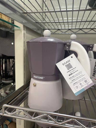
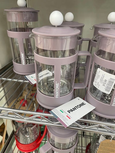
I happened across these two styles of coffee maker at Homesense in Saskatoon just this week. This would be a way to nod at the choice without the big commitment of a piece of furniture.
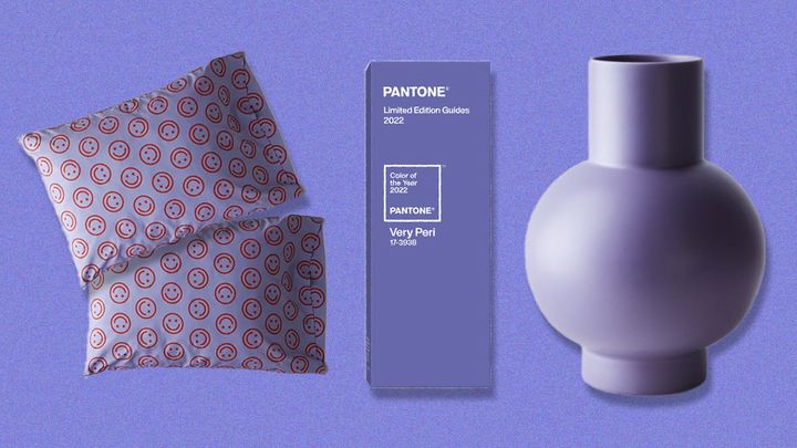
Alternatively you can add some accent pillows or pops of Very Peri decor items
An accent wall in your home space.
This little project could easily be done in an afternoon.
(Please tape off the ceiling & baseboards, you know how I dislike sloppy painting)
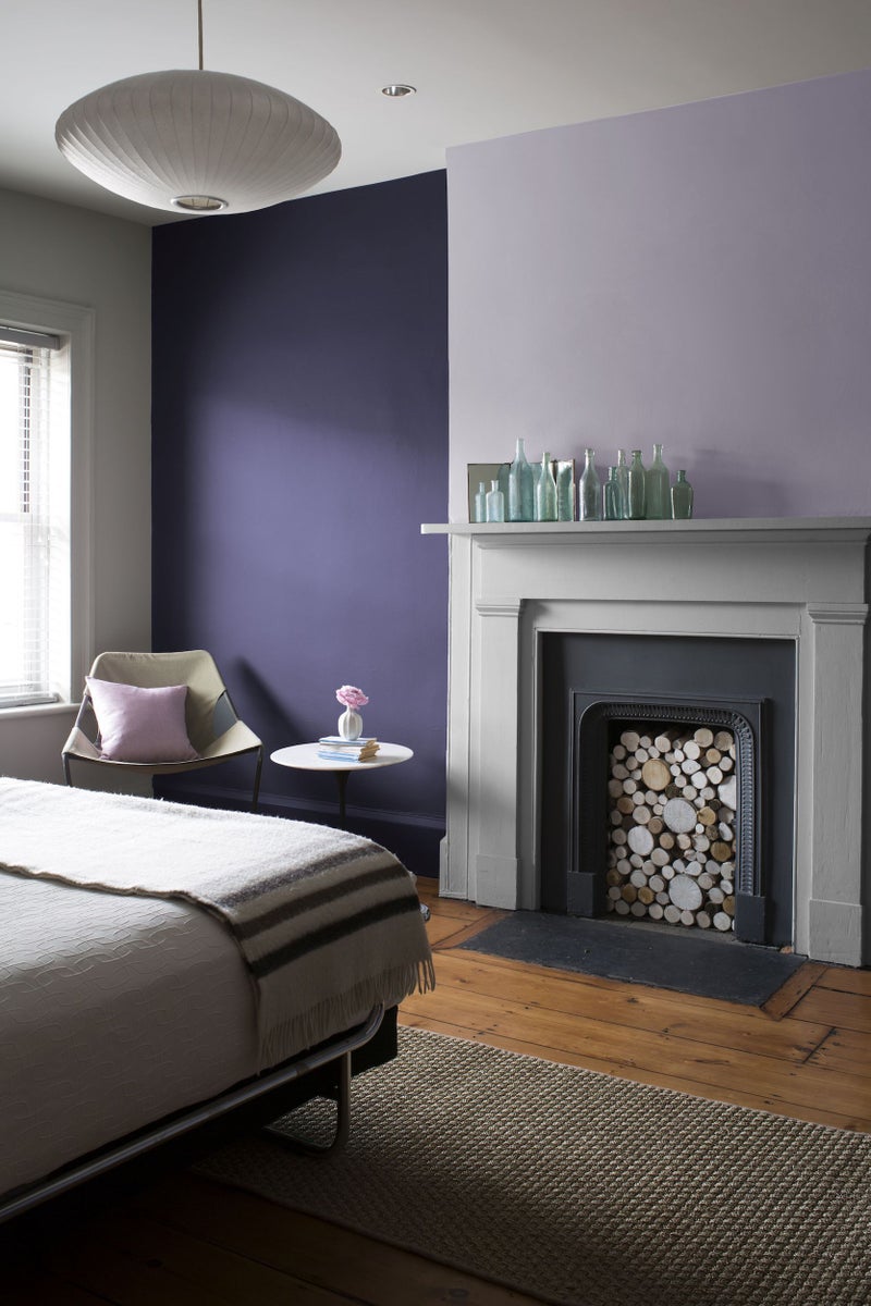
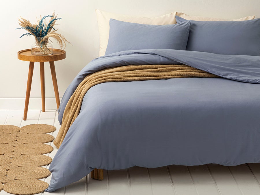
A soothing shade of Very Peri in your bedding. A linen or cotton version of the bedding would keep it subtle and relaxing.
*you can read more about the reasoning behind Pantone's choice here.
~Jillian